In the process of refurbishing your home, there are lots of things to keep in mind – from the style and arrangement of the furniture to the colours in which you will be painting your walls. And it seems that while we pay a lot of attention on the fleeing interior design trends, we somehow end up overlooking the importance of choosing the right colour combinations that will be found within your house.
Colour, however, have the unique power to influence your mood and thoughts as well as help you set particular atmosphere in each and every room and charge it with distinctive energy.
Actually, the scientific research done around the subject shows that people respond quite similarly when exposed to the same colours. For example, while some colours tend to evoke feelings of peace and tranquility, others could easily bring up feelings of sadness and anger.
So, prior to hitting the local supermarket to lay your hands on a dozen boxes of wall paint, why not have a cheeky look online and find out which colours are deemed most suitable for the rooms you’re currently refurbishing? And while doing so, also, think of the vibe you’d like a particular room to give off and of its size. Why? Because by employing the right colours, you could actually create visual illusions! For example painting a room in light and airy colours will make it seem bigger than it is, while the sophisticated ‘darks’, will make it look smaller and give it much more intimate touch. Similarly, if you want to make the walls seem higher, paint the ceiling in colours lighter than the walls, with the safest option always being ‘white’. Opting for a ceiling painted in darker colours than the wall, will visually lower it and make the room seem cosier. No wonder why most massage rooms in the Spa Centers have their walls and ceilings painted in dark pastel colours.
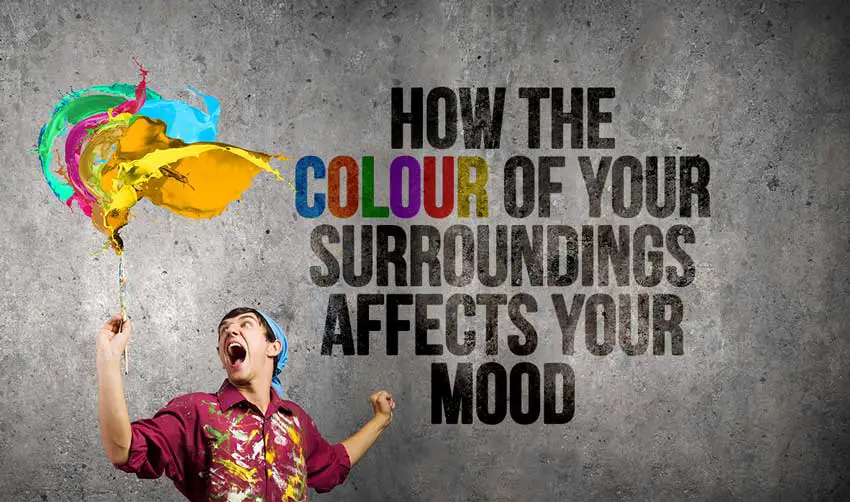
So what about the power each colour has?
Neutrals (white, brown, grey, black)
Neutral are the basic and primary colours within any decorator’s kit and are most often employed as the main colour scheme. Why we love them? Because they are flexible and can be easily combined with all the other colours. Black is the only neutral which could be quite overwhelming if used in big dozes which is why it is best used an accent.
Orange
While orange is certainly one of the happiest colours within the colour palette, it isn’t really the most suitable colour when it comes to painting your living room or bedroom. As it is more of an energizing colour, it would certainly do a much better job if used on the walls in your exercising room. Having the power to evoke feelings of excitement – it will certainly be aiding your calorie burn making the whole exercising process much more fun!
Green
Among all the colours, green is the colour most soothing for the eye, which turns it into the perfect choice for whichever room you want! For example, by painting your living room in green, you will be setting a friendly, comforting and inviting ambiance, while in the kitchen it will be cooling down a bit the heating cooking atmosphere. As it is also considered the colour that has the power to relieve stress, why not paint your bedroom walls in green?
Purple
By painting a room in the lighter shades of purple (lilac and lavender), you will be setting a peaceful and tranquil mood. In contrast, its darker shades (eggplant) are much more dramatic and give off feelings of lavishness and sophistication. As dark purple, similarly to black, could get a bit too overwhelming, it is best used as an accent to give a room a depth and in combination with its lighter shades.
Red
Certainly, the most aggressive and bold colour among all! Red brings up feelings of excitement and if used in the living room will stimulate chatty conversations! As red has the power to raise the heart rate and blood pressure, it’s not really the most suitable choice for your bedroom. However, as red has many shades, the darker versions of it, in combination with dimmed lights, will make your bedroom seem very elegant and sophisticated and won’t cause the adrenaline rush that it otherwise would.
Blue
Blue is the colour experts recommend for bedrooms and bathrooms as it lessens blood pressure and slows down the heart rate. However, while it is soothing and serene, pastel blue could give off quite cool and chilling vibes. That’s why it is best to combine walls painted in pastel blue with furniture dyed in warmer hues. Also, in contrast to the soothing pastel blue, the dark blue has the opposite effect and can easily bring up feelings of detachment and aloofness (you’ve hear the expression – feeling blue right?). So restrain yourself from using dark blue if you’re aiming for a cosy and relaxed home ambiance.
Yellow
While yellow is the colour of happiness and joy – it’s been found that when excessively used it might trigger people lose their temper much more easily than they otherwise would. So rather than using it as a main colour scheme, why not employ it as an accent? However if you yellow is YOUR colour and the one that will go best with your personality – then lemon yellow is certainly a great alternative to its more aggressive shades.
